Hot Rod Type
I love staring at vintage hot rod photographs. It takes a bit of a compulsive person to do it to the degree that I do, but with that sickness comes a reward of sorts. After hours of staring at the same poorly lit black and white photos, details begin to pop. My “real” career started in the realm of graphic design and typography, so it is only natural that one of things that I always focus on in said photos is lettering.
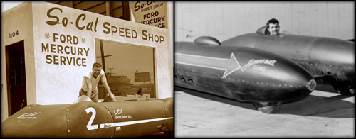
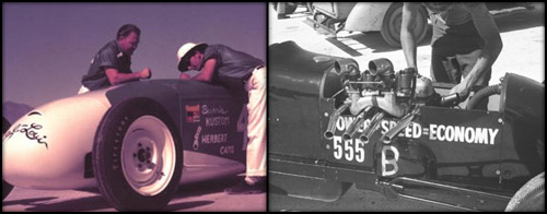
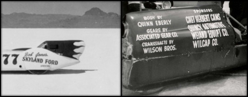
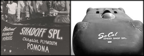
Companies/fellas like Kong, Edelbrock, Cyclone, Herbert, and Hildebrant were all trying to build a brand of their own in the late 40’s. As records went down at Bonneville, the manufacturers were quick to take credit and often times gave away free parts in exchange for their logo’s presence on the record breaking machine. It was one of the first examples of corporate sponsorship in organized racing.
The great part to me though and the most fun to look back on is the actual lettering and branding. There were no vinyl peel and stick jobs back then – all of this stuff was hand painted. Of course, there wasn’t one guy that did all of the Edelbrock lettering. There were sign painters and hobbyists that just got the job done when they were called upon. And when you have three or four guys lettering 10 different cars, there is a lot of differentiation and character to study. One guy might alter the character spacing in “Edelbrock” to avoid stretching the logo if he was slapping it on a track nose. Another might shear the “Kong” logo a little more than the next. The surface, the painter, the time of day… It all dictated the end result to a certain degree.
These are all details that have been lost in today’s race cars and something I think a lot of us forget about when lettering our own traditional race cars and hot rods. It’s only natural to want perfect lettering on our perfectly built cars and I think sometimes hand lettering scares the hell out of the modern man.
To the contrary, the art of lettering was actually much more refined in the past. They didn’t have the digital tools we have today, so the artists of the time were very practiced and skilled. If you’ve ever been lucky enough to see some examples of vintage lettering in person, you know the quality – even, sharp, and deliberate. Still, the thickness of the paint, the notion of a hand stroke, and differentiation mentioned above combined to give the lettering that one characteristic vinyl transfer simply can’t – character.
The good news? There is still a few guys out there with the bones, knowledge, and skill to pull these kinds of strokes off. From a style perspective, you won’t find anyone more knowledgeable about vintage type than Mark Simonson. He did the lettering on both The Jockey Journal as well as The Jalopy Journal and I couldn’t be happier with either. And when it comes time to put paint to brush, Dan Barnett is your man.
Check out more incredible lettering examples or submit your own here.